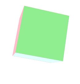
该效果主要通过设置计算后的延迟时间来达到正方体的各个边顺序动画的效果。一次动画结束后,通过触发animationend事件重置animation-name来实现重复动画的效果。
<!DOCTYPE html>
<html>
	<head>
		<meta charset="UTF-8">
		<title></title>
		<style type="text/css">
			ul{
    margin: 0;
    padding: 0;
    list-style: none;
}
.box{
    height: 100px;
    width: 100px;
    perspective: 500px;
    margin: 50px 0 0 50px;
}
.list{
    position: relative;
    height: 100px;
    width: 100px;
    background-color: blue;
    transform-style: preserve-3d;
    transform-origin: 0 0 0;
    animation: rotate 1s  10s 3 both linear;
}
.in{
    position: absolute;
    height: 100px;
    width: 100px;
}
.list .in:nth-child(6){
    background-color: pink;
    transform-origin: top;
    animation: in6 2s both;
}
.list .in:nth-child(5){
    background-color: lightgreen;
    transform-origin: right;
    animation: in5 2s 2s both;
}
.list .in:nth-child(4){
    background-color: lightblue;
    transform-origin: bottom;
    animation: in4 2s 4s both;
}
.list .in:nth-child(3){
    background-color: lightcoral;
    transform-origin: left;
    animation: in3 2s 6s both;
}
.list .in:nth-child(2){
    background-color: lightcyan;
    animation: in2 2s 8s both;
}
.list .in:nth-child(1){background-color: lightsalmon;}
.box:hover .list{
animation-play-state: paused;
}
.box:hover .in{
animation-play-state: paused;
}
@keyframes in6{
100%{transform: rotateX(90deg);
}}
@keyframes in5{
100%{transform: rotateY(90deg);
}}
@keyframes in4{
100%{transform: rotateX(-90deg);
}}
@keyframes in3{
100%{transform: rotateY(-90deg);
}}
@keyframes in2{
100%{transform: translateZ(100px);
}}
@keyframes rotate{
100%{transform: rotate3d(1,1,1,360deg);
}}
		</style>
	</head>
	<body>
		<div class="box">
    <ul class="list" id="list">
        <li class="in"></li>
        <li class="in"></li>
        <li class="in"></li>
        <li class="in"></li>
        <li class="in"></li>
        <li class="in"></li>
    </ul>
</div>
	</body>
	<script type="text/javascript">
		list.addEventListener('animationend',function(e){
    e = e || event;
    var target = e.target || e.srcElement;
    if(target.nodeName == 'UL'){
        list.style.animationName = 'none';
        var children = list.getElementsByTagName('li');
        for(var i = 0; i < children.length;i++){
            children[i].style.animationName = 'none';
        }
        setTimeout(function(){
            list.style.animationName = 'rotate';
            var children = list.getElementsByTagName('li');
            for(var i = 0; i < children.length;i++){
                children[i].style.animationName = 'in' + (i+1);
            }
        },100);
    }
},false);
	</script>
</html>
原文链接:https://www.qiquanji.com/post/8030.html
本站声明:网站内容来源于网络,如有侵权,请联系我们,我们将及时处理。

微信扫码关注
更新实时通知