边框内圆角
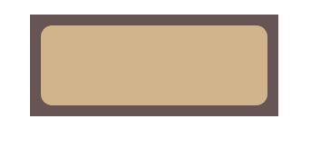
在学习多重边框的时候我们用到了两个属性box-shandow和outline,outline 描边并不会跟着元素的圆角走,但是box-shandow 是会的。因此我们利用两者的结合便可实现下图的效果
1、思路如下:为元素设置圆角,外层设置轮廓outline。圆角与直角之间的空隙用阴影补齐,阴影的尺寸为圆角半径的一半
<!DOCTYPE html>
<html>
	<head>
		<meta charset="UTF-8">
		<title></title>
		<style type="text/css">
			.uu{
	margin: 100px;
	width: 200px;
    height: 70px;
	border-radius:10px;
  	background: tan;
  	outline:10px solid #655;
  	box-shadow:0 0 0 5px #655;
			}
		</style>
	</head>
	<body>
		<div class="uu"></div>
	</body>
</html>
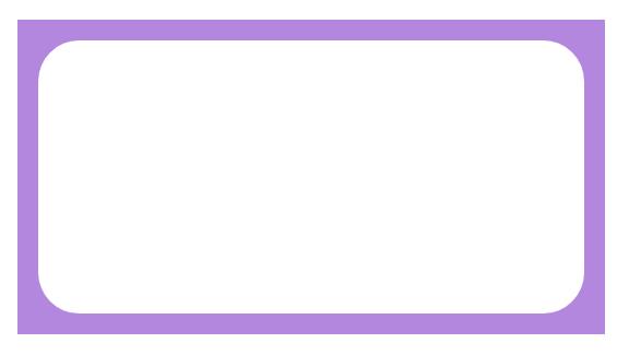
2、使用伪元素实现边框内圆角
<!DOCTYPE html>
<html>
	<head>
		<meta charset="UTF-8">
		<title></title>
		<style type="text/css">
	.uu{
		margin: 100px;
	position: relative;
	height: 200px;
    width: 400px;
    text-align: center;
     line-height: 200px;
     background: #FFF;
     border-radius: 30px;
	}
	.uu::before {
		 content: '';
     position: absolute;
     top: -15px; right: -15px; bottom: -15px; left: -15px;
     background: #B387DD;
     z-index: -1;
	}
		</style>
	</head>
	<body>
		<div class="uu"></div>
	</body>
</html>
原文链接:https://www.qiquanji.com/post/8695.html
本站声明:网站内容来源于网络,如有侵权,请联系我们,我们将及时处理。

微信扫码关注
更新实时通知