CSS遮罩效果和毛玻璃效果都是比较常用的,这节课我们就举例子详解怎么实现毛玻璃效果:
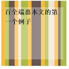
半透明颜色
半透明颜色最初的使用场景之一就是作为背景。将其叠放在照片类或其他花哨的背层之上,可以减少对比度,确保文本的可读性
下面是一个实例
<!DOCTYPE html>
<html>
	<head>
		<meta charset="UTF-8">
		<title></title>
		<style type="text/css">
.outer{
  position:relative;
  height: 200px;
  width: 200px;
   background: hsl(20,40%,90%);
  background-image:linear-gradient(90deg,#fb3 11px,transparent 0),
  linear-gradient(90deg,#ab4 23px,transparent 0),
  linear-gradient(90deg,#655 41px,transparent 0);
  background-size: 41px 100%,61px 100%,83px 100%;
}
.inner{
  position:absolute;
  top: 0;right: 0;left: 0;bottom: 0;
  font: bold 20px/1.5 '宋体';
  height: 160px;
  width: 180px;
  margin:auto;
  background:hsla(0,0%,100%,.3);
}
</style>
	</head>
	<body>
<div class="outer">
  <div class="inner">期权记本文的第一个例子</div>
</div>
	</body>
</html>
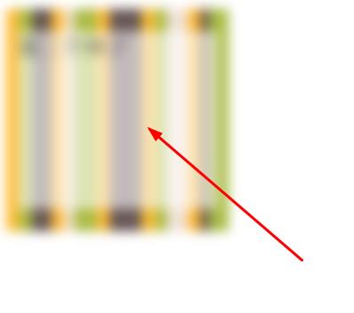
【增大不透明度】
设置为30%的不透明度,文字难以看清。当然,可以通过提升不透明度来增加文本可读性,但效果整个效果就没有那么生动了
background:hsla(0,0%,100%,.6);
自已去试一下,这个跟上面的代码差不多,就不举例了。
模糊处理
在传统的平面设计中,通常把文本层所覆盖的那部分图片区域作模糊处理。模糊的背景看起来不那么花哨,因此在它之上的文本就相对比较易读了。过去,由于模糊运算的性能消耗极其巨大,以致于这个技巧在网页设计中鲜有用武之地。不过,随着GPU的不断进化以及硬件加速的不断普及,眼下这个技巧已经逐渐流行起来
【父元素模糊】
如果直接对父元素设置模糊,则文本本身也会被模糊处理
<!DOCTYPE html>
<html>
	<head>
		<meta charset="UTF-8">
		<title></title>
		<style type="text/css">
.outer{
  position:relative;
  height: 200px;
  width: 200px;
   background: hsl(20,40%,90%);
  background-image:linear-gradient(90deg,#fb3 11px,transparent 0),
  linear-gradient(90deg,#ab4 23px,transparent 0),
  linear-gradient(90deg,#655 41px,transparent 0);
  background-size: 41px 100%,61px 100%,83px 100%;
  filter:blur(5px);
}
.inner{
  position:absolute;
  top: 0;right: 0;left: 0;bottom: 0;
  font:  20px/1.5 '宋体';
  height: 160px;
  width: 180px;
  margin:auto;
  background:hsla(0,0%,100%,.6);
}
</style>
	</head>
	<body>
<div class="outer">
  <div class="inner">第二个例子</div>
</div>
	</body>
</html>
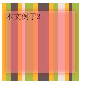
【伪元素模糊】
因此,对一个伪元素进行处理,然后将其定位到元素的下层
<!DOCTYPE html>
<html>
	<head>
		<meta charset="UTF-8">
		<title></title>
		<style type="text/css">
.outer{
  position:relative;
  height: 200px;
  width: 200px;
  z-index:1;
  background: hsl(20,40%,90%);
  background-image:linear-gradient(90deg,#fb3 11px,transparent 0),
  linear-gradient(90deg,#ab4 23px,transparent 0),
  linear-gradient(90deg,#655 41px,transparent 0);
  background-size: 41px 100%,61px 100%,83px 100%;
}
.inner:before{
  content:'';
  position:absolute;
  top: 0;right: 0;left: 0;bottom: 0;
  filter:blur(5px);
  background: rgba(255,0,0,0.5);
  z-index:-1;
}
.inner{
  position:absolute;
  top: 0;right: 0;left: 0;bottom: 0;
  font:  20px/1.5 '宋体';
  height: 160px;
  width: 180px;
  margin:auto;
  background:hsla(0,0%,100%,.3);
}
</style>
	</head>
	<body>
<div class="outer">
  <div class="inner">本文例子3</div>
</div>
	</body>
</html>
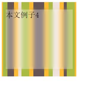
背景复制
下面复制父级元素的背景来替换半透明的红色。如果保证毛玻璃下的背景正好与父元素背景的图案相吻合呢?使用fixed即可,将父元素和伪元素的背景设置为相同,且都相对于视口设置,可实现目标
<!DOCTYPE html>
<html>
	<head>
		<meta charset="UTF-8">
		<title></title>
		<style type="text/css">
.outer{
  position:relative;
  height: 200px;
  width: 200px;
  z-index:1;
  background: hsl(20,40%,90%) fixed;
  background-image:linear-gradient(90deg,#fb3 11px,transparent 0),
  linear-gradient(90deg,#ab4 23px,transparent 0),
  linear-gradient(90deg,#655 41px,transparent 0);
  background-size: 41px 100%,61px 100%,83px 100%;
}
.inner:before{
  content:'';
  position:absolute;
  top: 0;right: 0;left: 0;bottom: 0;
  filter:blur(5px);
  background: hsl(20,40%,90%) fixed;
  background-image:linear-gradient(90deg,#fb3 11px,transparent 0),
  linear-gradient(90deg,#ab4 23px,transparent 0),
  linear-gradient(90deg,#655 41px,transparent 0);
  background-size: 41px 100%,61px 100%,83px 100%;
  z-index:-1;
}
.inner{
  position:absolute;
  top: 0;right: 0;left: 0;bottom: 0;
  font:  20px/1.5 '宋体';
  height: 160px;
  width: 180px;
  margin:auto;
  background:hsla(0,0%,100%,.3);
}
</style>
	</head>
	<body>
<div class="outer">
  <div class="inner">本文例子4</div>
</div>
	</body>
</html>
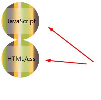
样式封装
毛玻璃样式封装如下
<!DOCTYPE html>
<html>
	<head>
		<meta charset="UTF-8">
		<title></title>
		<style type="text/css">
.frostedglass{
  width: 100px;
  height: 100px;
  font-size:16px;
  /*计算值为 height - width*top*2*/
  line-height: 70px;
  z-index:1;
  border-radius:50%;
  position:relative;
  overflow: hidden;
  text-align:center;
  background: hsl(20,40%,90%) fixed;
  background-image:linear-gradient(90deg,#fb3 11px,transparent 0),
  linear-gradient(90deg,#ab4 23px,transparent 0),
  linear-gradient(90deg,#655 41px,transparent 0);
  background-size: 41px 100%,61px 100%,83px 100%;
}
.frostedglass-inner:before{
  content:'';
  position:absolute;
  top: 0;right: 0;left: 0;bottom: 0;
  filter:blur(5px);
  background: hsl(20,40%,90%) fixed;
  background-image:linear-gradient(90deg,#fb3 11px,transparent 0),
  linear-gradient(90deg,#ab4 23px,transparent 0),
  linear-gradient(90deg,#655 41px,transparent 0);
  background-size: 41px 100%,61px 100%,83px 100%;
  z-index:-1;
}
.frostedglass-inner{
  position:absolute;
  top: 15%;right: 15%;left: 15%;bottom: 15%;
  background:hsla(0,0%,100%,.3);
}
</style>
	</head>
	<body>
<div class="frostedglass">
  <div class="frostedglass-inner">JavaScript</div>
</div>
<div class="frostedglass">
  <div class="frostedglass-inner">HTML/css</div>
</div>
	</body>
</html>
原文链接:https://www.qiquanji.com/post/6984.html
本站声明:网站内容来源于网络,如有侵权,请联系我们,我们将及时处理。

微信扫码关注
更新实时通知