对于实现纹理文本的效果,脑海中最直接能想到的办法可能是背景裁切background-clip
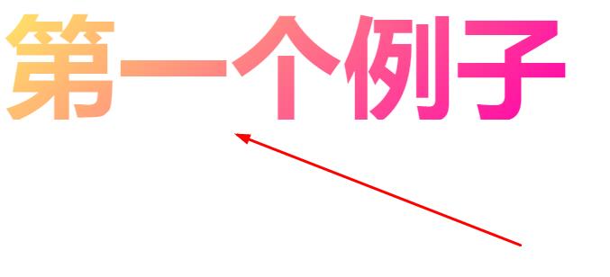
使用线性渐变来填充文本背景
语言表达能国不好,下面举例子来说大家都能看懂:
<!DOCTYPE html>
<html>
	<head>
		<meta charset="UTF-8">
		<title></title>
		<style type="text/css">
.box-with-text {
	background-image: linear-gradient(135deg,hsl(50, 100%, 70%), hsl(320, 100%, 50%));
-webkit-text-fill-color: transparent;
-webkit-background-clip: text;
background-size: cover;
font:bolder 100px/100px Impact;
position:absolute;
}
</style>
	</head>
	<body>
<div class="box-with-text">第一个例子</div>
	</body>
</html>
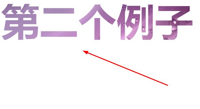
下面使用一个紫色图的背景,来制作纹理文本
<!DOCTYPE html>
<html>
	<head>
		<meta charset="UTF-8">
		<title></title>
		<style type="text/css">
.box-with-text {
background-image: url(https://www.qiquanji.com/data/img/dmj/201905151557888318258736.jpg);
-webkit-text-fill-color: transparent;
-webkit-background-clip: text;
background-size: cover;font:bolder 100px/100px Impact;position:absolute;
}
</style>
	</head>
	<body>
<div class="box-with-text">第二个例子</div>
	</body>
</html>
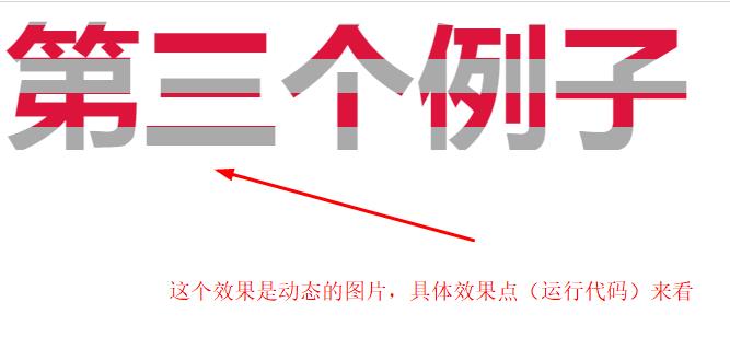
当然了,上面的代码放一张动态gif图也是没问题的。由于相代都是一样的就不举例了。
如果想要让填充动起来,可以通过animation移动背景的位置和尺寸来添加动画
<!DOCTYPE html>
<html>
	<head>
		<meta charset="UTF-8">
		<title></title>
		<style type="text/css">
@keyframes stripes {100% {background-position: 0 -50px;}}
.box-with-text {
	animation: stripes 2s linear infinite;
	background:linear-gradient(crimson 50%, #aaa 50%) 0 0/ 100% 50px ;
	-webkit-text-fill-color: transparent;
	-webkit-background-clip: text;
	font:bolder 100px/100px Impact;position:absolute;}
</style>
	</head>
	<body>
<div class="box-with-text">第三个例子</div>
	</body>
</html>
原文链接:https://www.qiquanji.com/post/6985.html
本站声明:网站内容来源于网络,如有侵权,请联系我们,我们将及时处理。

微信扫码关注
更新实时通知