<!DOCTYPE html>
<html lang="en">
<head>
<meta charset="UTF-8">
<title>Document</title>
<style type="text/css">
*{
padding: 0;
margin: 0;
}
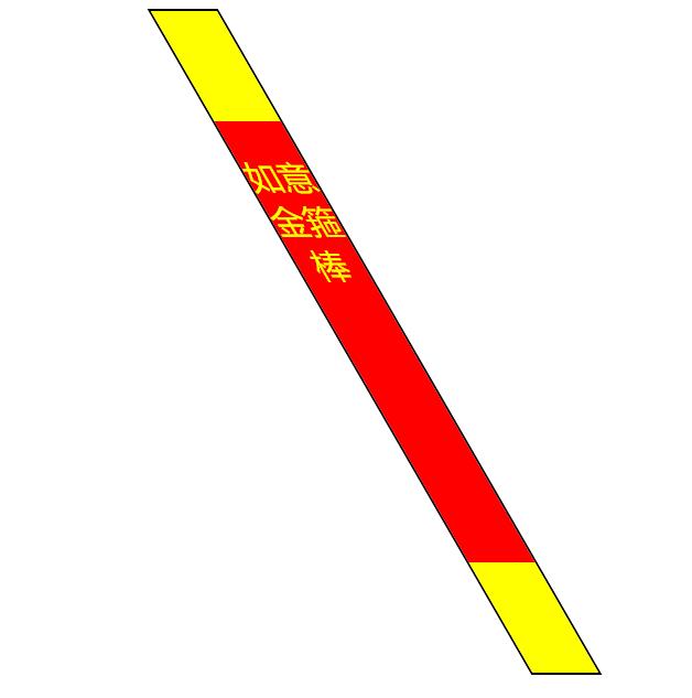
#jhreh{
width: 60px;
height: 600px;
border: 2px solid black;
margin: 10px auto;
/*transform变换 rotate旋转 30deg 角度*/
/*transform: rotate(30deg);*/
/*translate 平移 让元素相对于现在的位置进行平移 向右移100,向下移50,*/
/*transform: translate(100px,50px);*/
/*整体缩放效果 scale 比例 宽度原来的1.8倍,高度0.6倍*/
/*transform: scale(1.8,0.6);*/
/*扭曲效果 skew 斜的*/
transform: skew(30deg,0);
}
#jhreh div:nth-child(1){
width: 60px;
height: 100px;
background: yellow;
}
#jhreh div:nth-child(2){
width: 60px;
height: 370px;
background: red;
color: yellow;
font-size: 30px;
font-family: "微软雅黑";
text-align: center;
padding-top:30px;
}
#jhreh div:nth-child(3){
width: 60px;
height: 100px;
background: yellow;
}
</style>
</head>
<body>
<div id="jhreh">
<div></div>
<div>如意金箍棒</div>
<div></div>
</div>
</body>
</html>
原文链接:https://www.qiquanji.com/post/7492.html
本站声明:网站内容来源于网络,如有侵权,请联系我们,我们将及时处理。

微信扫码关注
更新实时通知