上代码演示:
<!DOCTYPE html>
<html>
	<head>
		<meta charset="UTF-8">
		<title></title>
		<style type="text/css">
			*{
				padding: 0;
				margin: 0;
			}
			.mi{
				width: 300px;
				height: 300px;
				border: 2px solid rgba(0,0,0,0.1);
				position: relative;
				/*overflow: hidden;*/    /*后面是要加这个overflow: hidden  但是想看到效果还是不加*/
				margin: 20px;
				top: 0;
				transition: all 1s;  /*上面top: 0; 这里要加个top值,要不然没top值会显得生硬*/
				float: left;
			}
			.mi .sk{
				width: 300px;
				height: 150px;
				background: darkgreen;
				position: absolute;
				top: 300px;
				left: 0;
				opacity: 0;  /*一开始透明度为0*/
				transition: all 1s;  /*监控小色块的*/
			}
			.mi:hover{
				top: -10px;
				box-shadow: 0 0 10px 10px rgba(0,0,0,0.05);
			}
			.mi:hover .sk{
				top: 150px;
				opacity: 1;  /*透明度变成1*/
			}
		</style>
	</head>
	<body>
		<div class="mi">
			<div class="sk"></div>
		</div>
		<div class="mi">
			<div class="sk"></div>
		</div>
		<div class="mi">
			<div class="sk"></div>
		</div>
		<div class="mi">
			<div class="sk"></div>
		</div>
	</body>
</html>
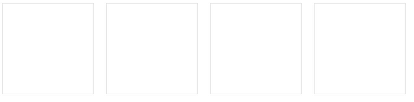
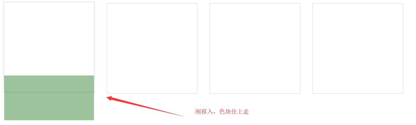
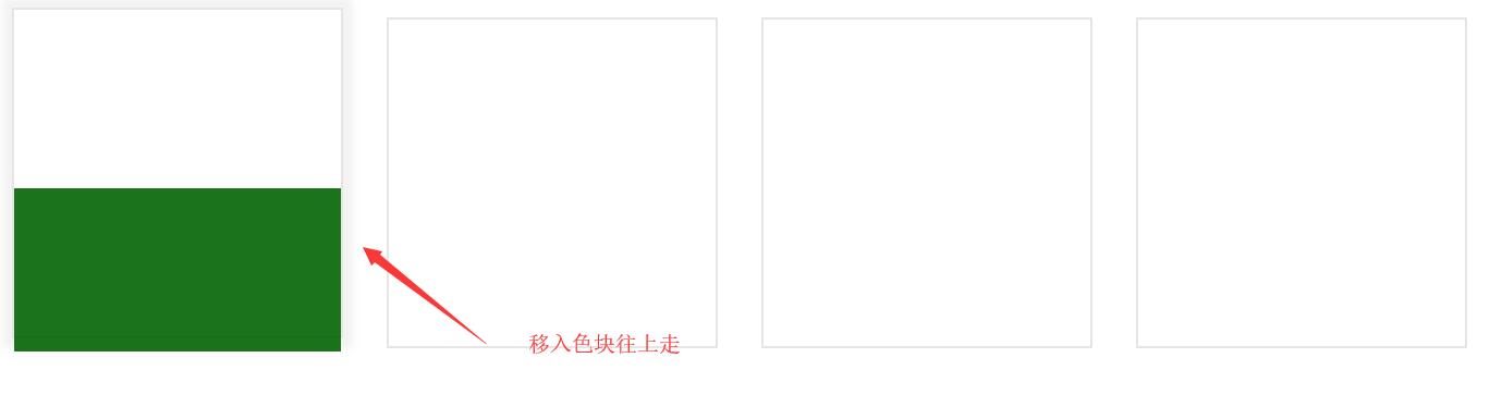
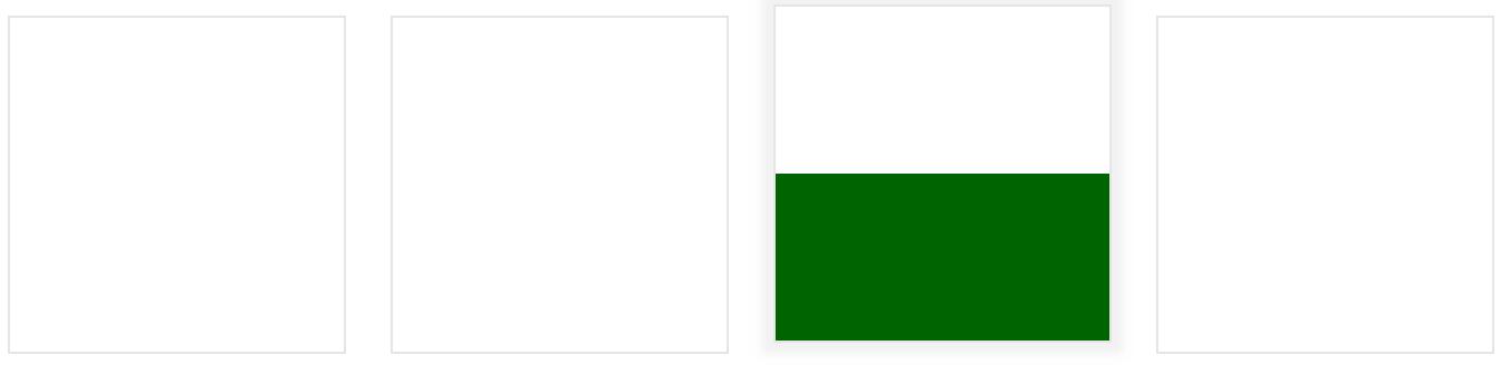
上面代码效果图片:
原文链接:https://www.qiquanji.com/post/7632.html
本站声明:网站内容来源于网络,如有侵权,请联系我们,我们将及时处理。

微信扫码关注
更新实时通知